Brand Kit
CanQuest Brand Kit
Logos, colors, and type for press, partners, and community creators. Use these assets as-is — keep the wordmark legible and never recolor the lockup outside the palette below.
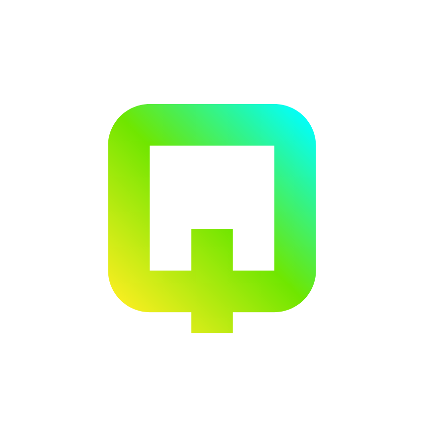
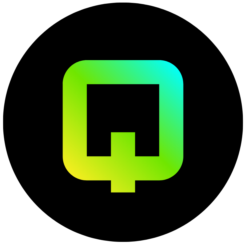
Logo
The default lockup is white-on-dark. Choose the variant that keeps the wordmark legible against its background — never place it over busy imagery.
Colors
CanQuest ships dark-first. Each swatch shows the dark value (tap to copy) with its light-theme counterpart underneath.
Canton Green
#38B478--primary / rgb(var(--canton-rgb))
Primary actions, links, focus rings, brand accents.
Canton Ink
#166534rgb(var(--canton-ink))
Brand text and the primary-on-dark wordmark glow.
Accent Cyan
#0D9488--accent
Secondary accents, tags, and highlights.
Background
#F4F6FA--background
App canvas. Default theme is dark.
Foreground
#0F1117--foreground
Body text and headings.
Muted Foreground
#5C6070--muted-foreground
Secondary text, captions, and metadata.
Typography
Inter carries the UI; Space Grotesk is reserved for display headings.
UI / Body
Inter
Aa Bb Cc 0123 — Quests, rewards, and verified humans on Canton.
Display
Space Grotesk
Aa Bb Cc 0123 — Headings and hero typography.
Usage guidelines
- • Keep clear space around the wordmark equal to the height of the C glyph.
- • Don't stretch, rotate, or add effects (shadows, outlines) to the lockup.
- • Don't recolor the logo outside the official palette above.
- • Minimum wordmark height: 16px on screen.
- • For print or merchandise, request a vector source via the Cooperation page.